FRAMER-SHOP KIT
DOCUMENTATION
Welcome to the world of online commerce with the Framer-Shop Kit. This guide is designed to help you fully leverage Framer's capabilities to create a customized, secure, and efficient online store. Whether you are a designer, developer, or entrepreneur, the Framer-Shop Kit provides everything you need to launch your e-commerce site on the Framer platform.
What is the Framer Shop Kit?
The Framer-Shop Kit is an all-in-one solution that enables you to build an integrated online store directly within Framer. With this kit, you can:
Set up an online store quickly: The kit includes predefined and customizable components to add products, manage shopping carts, and process purchases, all within Framer’s intuitive environment.
Fully customize your site: Tailor the look and functionality of your store to perfectly reflect your brand and meet the specific expectations of your customers.
Ensure secure transactions: The kit is designed to integrate secure payment solutions, thus protecting your customers’ data and ensuring the reliability of transactions.
The Framer-Shop Kit simplifies the creation of an online store by eliminating the technical complexities typically associated with e-commerce development. Follow this guide to discover how you can maximize all the features of the kit and launch your online store with confidence and success.
The Framer-Shop Kit is equipped with a range of components designed to make your e-commerce setup as straightforward and effective as possible. Each component is built with customization and functionality in mind, allowing you to design and operate an online store that is both attractive and user-friendly. Here’s a brief overview of the key components included in the kit:
Key Components of the Framer-Shop Kit:
Add to Cart Button
Function: This button allows users to select products and add them to their shopping cart with a simple click.
Navigate to this section
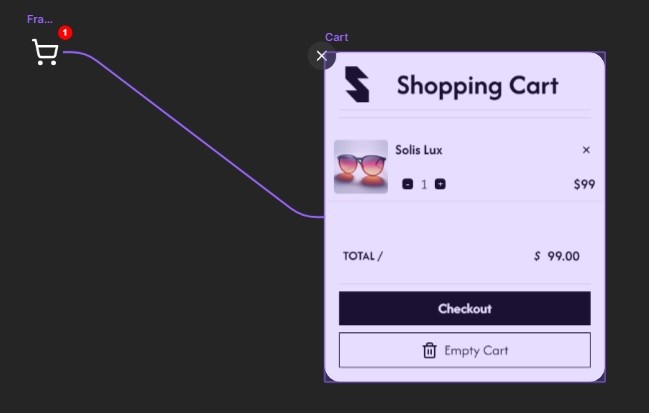
Cart Icon Button with Item Count
Function: Displays a dynamic icon on the page that updates in real time to show the number of items currently in the shopping cart. Clicking on this icon also allows users to open the cart to view or modify their selected items.
Navigate to this section
Cart List Component
Function: Provides a detailed list of all items in the shopping cart, allowing users to see product summaries, adjust quantities, or remove items entirely.
Navigate to this section
Total Cart Component
Function: Calculates and displays the total cost of all items in the shopping cart, ensuring customers are aware of the amount they will be expected to pay at checkout.
Navigate to this section
Empty Cart Button
Function: Enables users to clear all items from their cart at once, simplifying the process for those who wish to start their shopping over.
Navigate to this section
Checkout Button
Function: Initiates the checkout process, guiding customers through providing payment and shipping information.
Navigate to this section
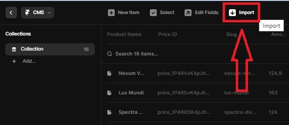
CMS Configuration
Function: A pre-configured content management system setup that includes all necessary data fields like product names, prices, descriptions, and images, which are essential for managing your online store efficiently.
How to Use This Documentation ?
The upcoming sections of this guide will delve into each component in detail, providing step-by-step instructions on how to integrate and customize them within your Framer project. By the end of this guide, you will be equipped to use every feature of the Framer-Shop Kit to its full potential, ensuring a smooth launch and successful operation of your online store.
Stay tuned as we explore each component more closely, giving you the tools and knowledge needed to create a fully functional and visually appealing e-commerce platform.
Introduction
Before you start accepting payments on your Framer-Shop online store, the first step is to set up a Stripe account. Stripe is a payment processing platform known for its security and efficiency.
Why Choose Stripe?
Security: Stripe complies with the strictest PCI standards and uses the best security tools and practices to protect your transactions.
Ease of Integration: Although not covered here, Stripe is known for its ease of integration with various platforms.
Global Acceptance: Stripe enables you to accept payments from customers worldwide, supporting a variety of currencies and payment methods.
How to Create a Stripe Account
Visit Stripe:
Go to Stripe's website and click on the “Sign Up” button.
Fill in the Registration Form:
Enter the necessary information such as your email address, a secure password, and your country of residence.
Agree to the terms of service and the privacy policy.
Verify Your Email:
Look for a verification email from Stripe in your inbox and click on the verification link to confirm your email address.
Complete Your Account Setup:
Provide additional details about your business, such as business type, address, and banking information for payments.
Depending on your location and business structure, additional documents may be required to meet regulatory requirements.
Stripe Documentation and Support
For more information on setting up your Stripe account and for detailed guides, visit Stripe's official documentation.
This section guides you through the fundamental steps for opening a Stripe account, preparing your Framer-Shop online store to accept secure payments.
Introduction
Once your Stripe account is set up, the next crucial step is to retrieve your public API key. This key is essential for integrating payment processing capabilities into your Framer-Shop online store.
Why Do You Need the API Key?
Integration: The public API key allows your Framer-Shop to communicate securely with Stripe, facilitating the payment process.
Security: Using the API key, all transaction requests are authenticated, ensuring that they come from a trusted source (your store).
How to Retrieve Your Stripe Public API Key
Log In to Your Stripe Dashboard:
Access your Stripe account by logging in at Stripe's website.
Navigate to the API Section:
Once logged in, locate the "Developers" tab in the sidebar. Click on it, then select "API keys" from the dropdown menu.
Locate Your API Keys:
In the API keys section, you will find two types of keys: Publishable Key and Secret Key.
Important: For now, you will only need the Publishable Key for setting up your Framer-Shop.
Copy Your Publishable Key:
Click to reveal your Publishable Key if it is hidden.
Carefully copy the key, ensuring there are no extra spaces or characters.
Important Security Note
Distinguish Carefully: Make sure to take the Publishable Key, not the Secret Key, for this step.
Keep It Secure: Never share your Secret Key publicly or with unauthorized individuals. The Publishable Key is designed for actions that require visibility in the browser, like generating tokens for payment processing.
Next Steps
Store Your Key Safely: Ensure you keep your API key in a secure place. You will need to enter this key into your Framer-Shop settings to connect it with Stripe and start accepting payments.
This step is critical for setting up your payment gateway and ensuring that your Framer-Shop can securely handle transactions. Make sure to follow these instructions carefully to avoid any issues with your payment setup.

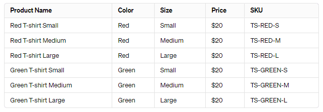
How to Create the Table:
Define Your Products:
Start by listing each variation as a separate product. This will allow you to track inventory and manage sales for each variant individually.
Specify Details:
For each product variation, specify the color and size.
Ensure that each variant has a unique SKU (Stock Keeping Unit), which helps in tracking and managing inventory.
Set Consistent Pricing:
If the pricing is consistent across the same product type but varies by size or color, make sure this is clearly stated and reflected in your table.
Once activated, you should see a confirmation like this in your Stripe Checkout settings.
Component Customization
Each component of the Framer Shop Kit is designed to offer maximum flexibility, allowing you to adjust various aspects to perfectly fit the visual identity of your online store. In the following sections, we will delve into the customization options available for each component in detail. You will learn how and what aspects you can modify, and how each component functions.
Introduction to Customization
Before we dive into the specifics of each component, let's understand the importance of customization in building your store:
Alignment with Brand Aesthetics: The ability to change colors, fonts, and layouts allows your store to reflect the unique aesthetics of your brand, thus providing a consistent experience to your customers.
Adaptability to User Needs: Adjusting component functionalities helps to effectively meet the specific needs of your users, enhancing their shopping experience.
Next Step: Component Details
In the upcoming paragraphs, each component will be detailed individually. For each component, we will provide specific instructions on the following:
Key Features: What are the main functionalities of the component and how they benefit the user experience.
Customization Options: How you can customize this component, including properties that can be adjusted such as colors, fonts, sizes, and more.
Integration and Functionality: How to integrate the component into your Framer project and how it interacts with other components or with your backend.
Each section aims to give you a clear understanding of how to maximize the use of the component to enrich your Framer store, ensuring that you are equipped to create a user experience that not only works well but is also aesthetically pleasing.
Introduction to Functionality
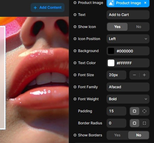
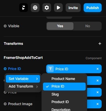
The FramerShopAddToCart button is designed to make adding products to the shopping cart a seamless experience. Once you select the button within your Framer workspace, you'll see the configuration panel appear on the right side. Here's how to get your button up and running quickly for all the items in your store:
Configuration Panel Breakdown:
At the top of the FramerShopAddToCart component's configuration panel in Framer, you will find fields such as Price ID, Product Name, Price, and Product Image.
Setting Up the Button:
To make your button functional, it’s advisable to place it within a CMS Collection List or on a product page. This setup allows you to utilize the
Set Variablefunction to link each variable from the CMS to the corresponding property of the button. UsingSet Variableas shown in the example image (not displayed here) helps integrate CMS data directly with the button functionality.
Customizing Button Appearance
Below the functional properties in the configuration panel, there are numerous style properties that allow you to customize the appearance of your Add To Cart button to fit the aesthetic of your brand:
Style Customization Options:
You can modify the button’s visual attributes extensively. Options include adjusting the button’s color, font, size, padding, borders, and much more. This level of customization ensures that the button not only performs its function but also complements the visual theme of your store.
Applying Custom Styles:
Each style option is designed to be intuitive, allowing you to easily apply changes and see them reflected immediately. Whether you want to match your brand colors or adjust the button size to better fit your layout, these tools provide you with the flexibility needed to create a cohesive and appealing user interface.
Finalizing and Testing
Ensure Functionality: Once you have configured and customized your button, it's important to test it within your store to ensure that it works correctly. This includes verifying that the button adds the correct items to the cart and that all linked data displays appropriately.
Review and Adjust: After testing, make any necessary adjustments to the button's functionality or style based on user feedback or your own observations to enhance the shopping experience.
By following these steps, the FramerShopAddToCart button can be fully integrated and customized within your Framer project, making it an effective tool for driving sales and enhancing the customer's shopping experience.
Functionality of the Cart Button
The Cart button in the Framer Shop Kit is designed to provide easy and direct access to your customers' shopping cart. Here’s how to set up the button to ensure it functions correctly in your online store:
Connecting to the Cart:
The primary functional setup for the Cart button is to connect it directly to your shopping cart. This enables the button to display cart information and gives users a quick overview of the items they have added.
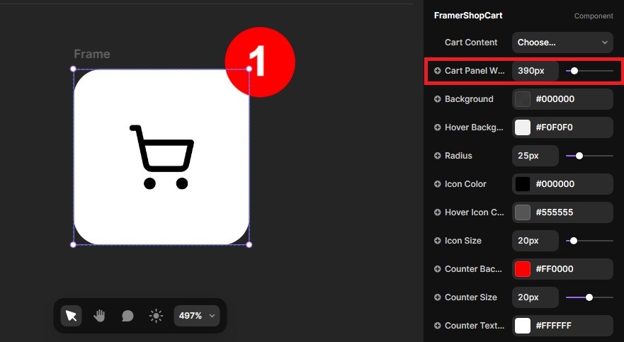
Adjusting Dimensions:
Ensure that the width and height of the Cart button match those of the cart element on your page to ensure aesthetic and functional integration. Proper alignment of dimensions ensures that the button is both visible and accessible without disrupting the layout of your user interface.
Customizing the Cart Button
Like the Add To Cart button, the Cart button offers extensive customization options to align with the design of your store:
Style Options:
You can customize many aspects of the Cart button, including the color of the cart icon, the background color of the button, as well as the color and format of the item count.
Each style control is designed to be user-friendly, allowing for quick and effective modifications so that the button perfectly integrates with your site’s aesthetics.
Applying Styles:
Modifying the appearance of the Cart button is as simple as adjusting settings in the configuration panel on Framer. Adjustments may include changing colors to make the button stand out or blend in with your overall design, adjusting text size for better readability, or even altering the button's shape to better match your visual theme.
Conclusion
Testing and Adjustments:
Once you have configured and customized the Cart button, it is crucial to test it in the actual context of your store to ensure it functions as expected. Check that interactions with the button are smooth and that all displayed information is correct.
Feel free to make adjustments based on user feedback or your own observations to refine the user experience.
By integrating and customizing the Cart button in your Framer project, you enhance the accessibility and functionality of your online store, which can help to increase customer satisfaction and sales.
Link the FramerShopButtonCart to your Shopping Cart
Ensure that the width and height of the Cart button match those of the cart element on your page to ensure aesthetic
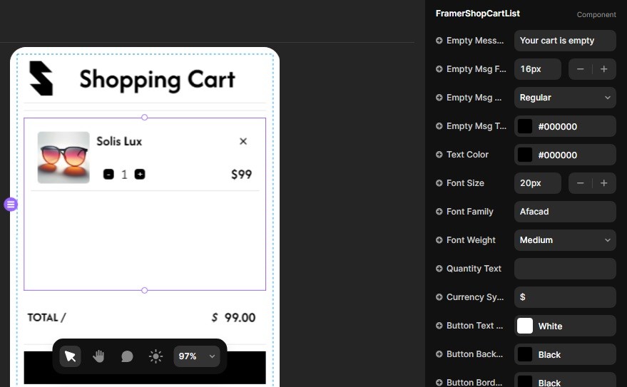
The FramerShopCartList component is essential for showcasing each item that users add to their cart. Unlike the FramerShopCart button that provides access to the cart, the FramerShopCartList is responsible for displaying the items within the cart dynamically.
Functionality of the FramerShopCartList
Automatic Item Display:
The FramerShopCartList component automatically lists all items that have been added to the shopping cart. It requires no functional setup related to the operations of the cart, as it inherently fetches and displays the cart contents.
Customizing the FramerShopCartList
Style Customization:
Every aspect of the FramerShopCartList component can be styled to match the aesthetics of your website. You can modify properties such as color, font, and layout to ensure the cart list complements the overall design of your store.
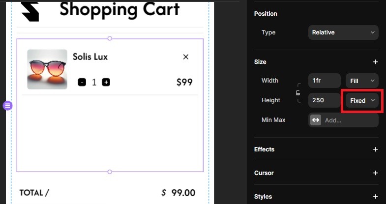
Height Adjustment:
It's advisable to fix the height of this component, especially if your cart may contain many items. Setting a fixed height helps maintain a clean and organized appearance, preventing the cart from expanding excessively, which can disrupt the visual flow and aesthetic of the page.
If you set the height property to fit content, the entire cart's height will increase as more items are added, which can lead to a cluttered and potentially unattractive display.
Recommendations for a Cohesive Design
Maintain a Consistent Look:
Ensure that the styling of the FramerShopCartList aligns with other components in your store. Consistency in design elements like color schemes, fonts, and button styles enhances the user experience and strengthens brand identity.
Test the Interaction:
Regularly test how the cart list behaves as items are added or removed. This helps ensure that the user interface remains user-friendly and functional, regardless of cart size.
By focusing on these elements, the FramerShopCartList can be an effective tool for enhancing the shopping experience on your site. It allows customers to see what they have added to their cart at a glance, providing a clear and straightforward way to review their potential purchases.
Visualizing Items in the CartList
To see your products displayed in the CartList instead of just viewing a placeholder message, you need to add items to the cart and then view your site in preview mode on Framer. Here’s a step-by-step guide on how to do this:
Step 1: Add Products to the Cart
Ensure that your FramerShopAddToCart buttons are correctly set up on your product pages. Each button should be linked with the respective product details such as Product ID, Name, Price, and Image.
Step 2: Enter Preview Mode
Switch your Framer project to preview mode. This mode allows you to interact with the project as if it were live, enabling you to test functionalities like adding items to the cart.
Step 3: Test the FramerShopAddToCart Button
Navigate to the page where your products are displayed.
Click on the FramerShopAddToCart buttons for one or more products. This action simulates the customer experience of adding items to their shopping cart.
Step 4: View the CartList
After adding items, visit the page or component where your FramerShopCartList is located. You should now see the items you added listed in the CartList. This component will dynamically update to show all the products currently in the cart along with options to adjust quantities or remove items.
Why Preview Mode?
Using preview mode in Framer is crucial for testing the real-time functionality of your e-commerce setup. It helps ensure that all interactive elements, like your add-to-cart and cart-listing features, work as intended before you publish your site.
Additional Tips
Verify Data Bindings: Make sure that all data bindings from the FramerShopAddToCart button to the FramerShopCartList are correctly configured to reflect updates immediately.
Continuous Testing: Regularly test these functionalities as you make changes to your project to ensure that the shopping experience remains smooth and error-free.
By following these steps, you can effectively demonstrate and test how products are added to and displayed in the cart, providing a seamless transition from shopping to checkout for your users.
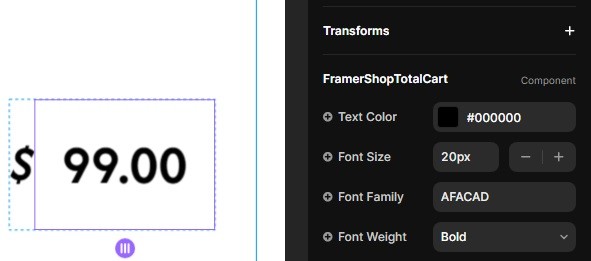
The FramerShopTotalCart component is designed to give users a clear and concise view of the total cost of items in their shopping cart. This component is kept separate to allow for flexible display options within your store layout.
Customizing the FramerShopTotalCart
Text and Size Properties:
This component allows you to modify only the text properties and size, which include changing the font, color, and size of the text displayed. These simple adjustments can significantly impact how the total is perceived by shoppers.
Tailoring these properties ensures that the total cart amount is both legible and visually harmonious with the rest of your store’s design.
Styling Flexibility:
While the basic customization options cover most needs, you have the flexibility to add further stylistic elements directly within Framer. For example, if you want the total cart amount to stand out more prominently, you could place the component on a colored background or within a distinct frame.
This approach allows you to enhance the visibility and aesthetic appeal of the total amount, making it easier for customers to see the total at a glance and reinforcing the checkout incentive.
Implementation Tips
Consistency in Design:
Ensure that the styling of the FramerShopTotalCart matches the overall theme of your online store. Consistent use of colors, fonts, and design motifs helps create a cohesive shopping experience that can enhance customer satisfaction and brand loyalty.
Enhancing Visibility:
Consider the placement of the FramerShopTotalCart component carefully. It should be positioned in a location that is easily visible during the shopping process, such as near the Cart button or at the bottom of the shopping cart summary page.
Test for Clarity:
Regularly test the display of the total cart amount, especially after making style or text adjustments. Ensure that the information is always easy to read and understand at a glance, which is crucial for providing a seamless checkout process.
By focusing on these customization and implementation strategies, the FramerShopTotalCart component can effectively communicate the total cost to your customers, encouraging them to proceed to checkout. Properly integrating and styling this component within your Framer project enhances the functionality and aesthetic of your online store, contributing to a better overall user experience.
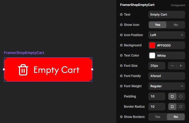
The FramerShopEmptyCart button is a crucial component for any online store, providing a straightforward method for users to reset their shopping cart. This function enhances user control over their shopping experience by allowing them to easily remove all items if they decide to start over or have changed their mind.
Customizing the FramerShopEmptyCart Button
Style Customization:
Similar to other buttons in the Framer Shop Kit, the FramerShopEmptyCart button offers extensive style customization options. You can modify its appearance to match the design of your online store. This includes adjusting the button’s colors, fonts, size, and more to ensure it fits well within your site’s aesthetic.
Styling this button to be clear and conspicuous is important as it performs a critical function. It should be easily identifiable but also harmonize with the overall design theme of the cart and checkout area.
Visual Consistency:
It’s important that the FramerShopEmptyCart button maintains visual consistency with other interactive elements in your store. Use similar styling cues from other buttons like the FramerShopAddToCart and FramerShopCart buttons to ensure a cohesive user interface.
Consider using distinctive colors or icons that intuitively communicate the button's function to empty the cart, which can prevent accidental clicks and improve user experience.
Implementation Considerations
Placement and Visibility:
The placement of the FramerShopEmptyCart button should be strategic. It’s typically best placed somewhere near the cart summary or checkout area where it’s visible but not overly prominent, reducing the risk of accidental use.
Ensure the button is accessible but also offers a confirmation step or undo option to mitigate accidental cart empties, which can frustrate users.
Testing Functionality:
Thoroughly test the functionality of the FramerShopEmptyCart button to ensure it works as expected. Verify that it clears the cart effectively and refreshes the page or updates the cart status without any issues.
Testing should also include ensuring that the button does not interfere with other functionalities or lead to unexpected behaviors within the shopping cart experience.
By carefully integrating and styling the FramerShopEmptyCart button, you enhance the shopping experience by providing users with clear, easy-to-use control over their cart contents. This button, while simple, plays a vital role in the shopping process and should be handled with attention to detail to maintain a positive user experience.
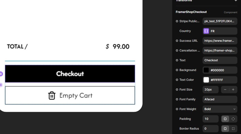
The FramerShopCheckout button is a pivotal component of the Framer Shop Kit, enabling users to proceed to the payment page and complete their purchases securely. This button not only facilitates a smooth transaction process by integrating with Stripe but also offers extensive customization options to align with the aesthetics of your online store.
Setting Up the FramerShopCheckout Button
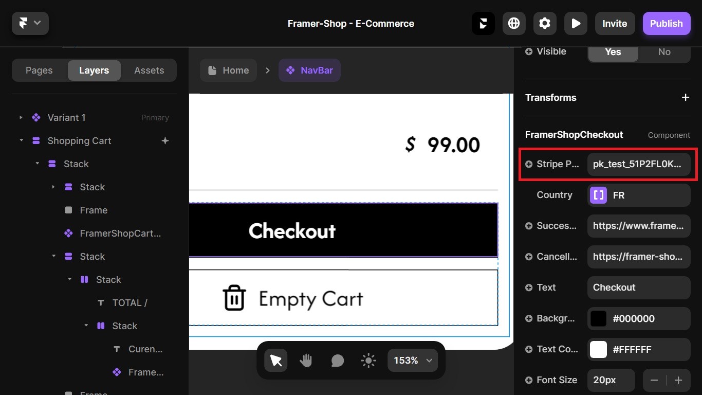
Stripe Public Key:
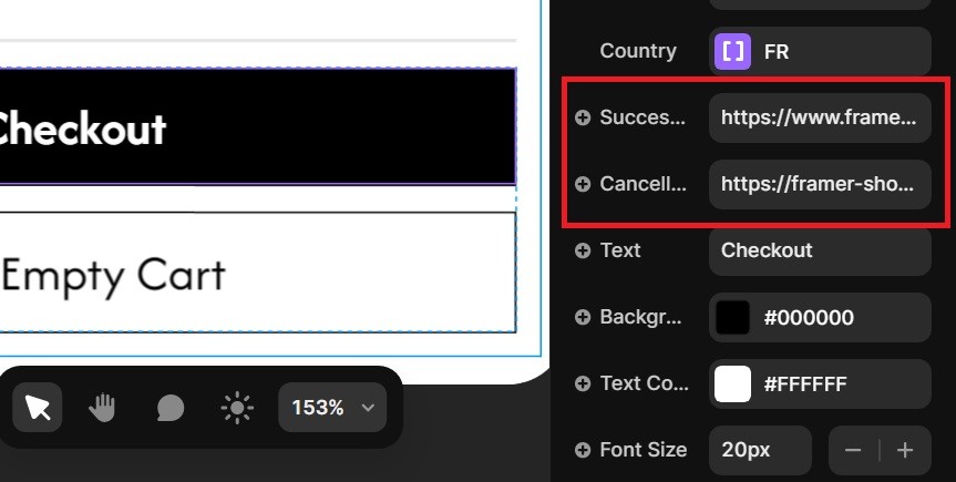
Within the button's properties, there is a field named "Stripe Public Key". Here, you should enter the public key you retrieved from Stripe, which was covered in the first part of our documentation. This key is essential for integrating Stripe's payment processing capabilities into your store.
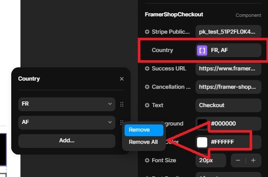
Country Field:
Another important property is the "Country" field. This allows you to specify the countries to which you are willing to ship and sell your products. By default, this field is set to accept orders from all countries. However, to ensure compliance and manage shipping logistics effectively, you may choose to limit this to specific countries.
Verify that your Stripe account settings allow for international sales and fulfill any legal requirements needed to sell and ship internationally. For optimal operation and to increase conversion rates, consider setting up separate online stores for different countries if you plan to sell globally.
Success and Cancellation URLs:
You also need to specify the "Success URL" and "Cancellation URL":
Success URL: This is the webpage to which users are redirected after a successful payment. It’s important to provide a URL that confirms the transaction success, thanking the customer and perhaps offering next steps like tracking their order.
Cancellation URL: This is the webpage users are directed to if they decide to cancel their payment at the checkout stage. This page should encourage them to reconsider their cancellation or provide options to continue shopping.
Ensure these URLs begin with "https://" to maintain secure and trustworthy links for your users.
Visual Design Enhancements
Colors and Text:
You have complete control over the color scheme and text properties of the FramerShopCheckout button. Beyond just adjusting the background and text colors, consider experimenting with hover effects and active states to make the button more interactive and visually engaging for users. This can help guide user behavior and make the checkout process more intuitive.
Fonts:
The typography of the button can be finely tuned to align with your brand’s design language. Extend your customizations to include letter spacing, line height, and text shadow, providing a distinct style that enhances readability and visual impact.
Dimensions:
Adjusting the size and padding of the button is crucial for user interaction, but you can also manipulate margins to ensure the button is optimally positioned within your layout. Consider the button's placement and visibility on various devices to optimize user engagement.
Borders and Corners:
While standard borders and rounded corners are commonly adjusted, you can further enhance your button with border styles such as dotted, dashed, or double lines. Experiment with border widths and color gradients to make the button stand out or blend in as required by your design strategy.
Implementation and Testing
The FramerShopCheckout button is pivotal in transforming browsing into sales, making the checkout process not only a gateway to conversion but also a part of the customer's overall experience with your brand. By ensuring that this button is fully optimized in terms of functionality, security, and design, you set the stage for a successful and secure transaction process that benefits both your business and your customers.
Holistic Approach to Checkout Success: Ensuring that the FramerShopCheckout button is compliant with the latest security standards and fully integrated with Stripe safeguards your transaction process, protecting sensitive customer information and reinforcing trust in your platform. Regular testing of the checkout process is essential to confirm that the button performs its intended functions effectively and leads users through the expected transaction flow without any issues. Additionally, making the checkout process as smooth and intuitive as possible helps minimize cart abandonment and enhances user satisfaction.
Unified Design and User Feedback: Maintaining stylistic consistency with other elements on your site helps create a seamless user interface that is easy to navigate and understand. Visual consistency not only aids in user engagement but also builds a cohesive brand image. By regularly testing the button’s appearance and functionality across various devices and listening to user feedback, you can continuously refine its design to meet the evolving expectations of your customers.
In conclusion, the FramerShopCheckout button plays a crucial role in your e-commerce environment. Properly setting up, customizing, and continuously improving this button based on user interactions and feedback ensures that it remains an effective tool for facilitating secure and efficient purchases. Through thoughtful implementation and ongoing optimization, the FramerShopCheckout button can significantly enhance the shopping experience, leading to higher conversion rates and fostering lasting customer relationships.
Past Your Stripe Public Key Here.
Select the countries where you have the right to ship your products. (If you do not select Authorized Countries in your Stripe account settings it will not work).
Make sure your redirect urls look like this: https://www.example.com
And not like this: www.example.com
Final Thoughts
We hope this documentation has provided you with all the necessary information to successfully integrate and utilize the Framer Shop Kit in your projects. Our goal is to ensure that you have a smooth and enjoyable experience creating and managing your online store, enhancing both functionality and aesthetics with our comprehensive toolset.
Need Assistance?
If you encounter any challenges or have questions as you set up or customize your Framer Shop Kit, we're here to help! Our dedicated support team is committed to providing you with the assistance you need to make the most out of your investment.
Contact Us:
Email Support: For detailed inquiries or if you need step-by-step assistance, feel free to email us at support@framer-shop.com. We strive to respond to all emails promptly.
Social Media: Follow us on Twitter @FramerDesigner for the latest updates, tips, and community insights. You can also reach out to us here for quick questions or to share your success stories.
Contact Form: For your convenience, you can also use our online contact form available on our website. This is a great way to get in touch for any support queries or to request personalized guidance.
Stay Connected
To keep up with new features and updates, or for helpful tutorials and community stories, make sure to connect with us on our social media platforms. Your feedback and success stories inspire us to continually improve and expand our offerings.

